whitson+ - Comparison Plot Certification
1. Introduction
Complete the steps outlined below to become a certified whitson+ user. This includes plot creation, smoothing, coloring, customization, normalization, and aggregation. Then, for more advanced, it includes appending forecasts, multiple axes, 2x2 plots, and RTA plots (PNRs and RNPs). Those certified have the software skills necessary to utilize every comparison plot feature for any projects.
Need help?
Send an e-mail to support@whitson.com.
1.1. Before Starting
Make sure you have watched these three videos in the Getting Started part of the manual (click here).
- Login (1 min)
- Overview of important basics (3 min 30 sec)
- Zoom lots (3 min)
1.2. Create a Project
- Go to the Project module in the navigation panel.
- Click ADD PROJECT up to the right.
- Name the project "your name - whitson certificate".
- Click SAVE.
- All steps are shown in the .gif above.
1.3 Upload Well Data
- Click MASS UPLOAD up to the right.
- In the pop-up window, select EXAMPLES
- Search for Comparison Plot Certificate Wells and click UPLOAD.
- All the data will be uploaded into the project. You can then close the Mass Upload pop-up window.
- All steps are shown in the .gif above.
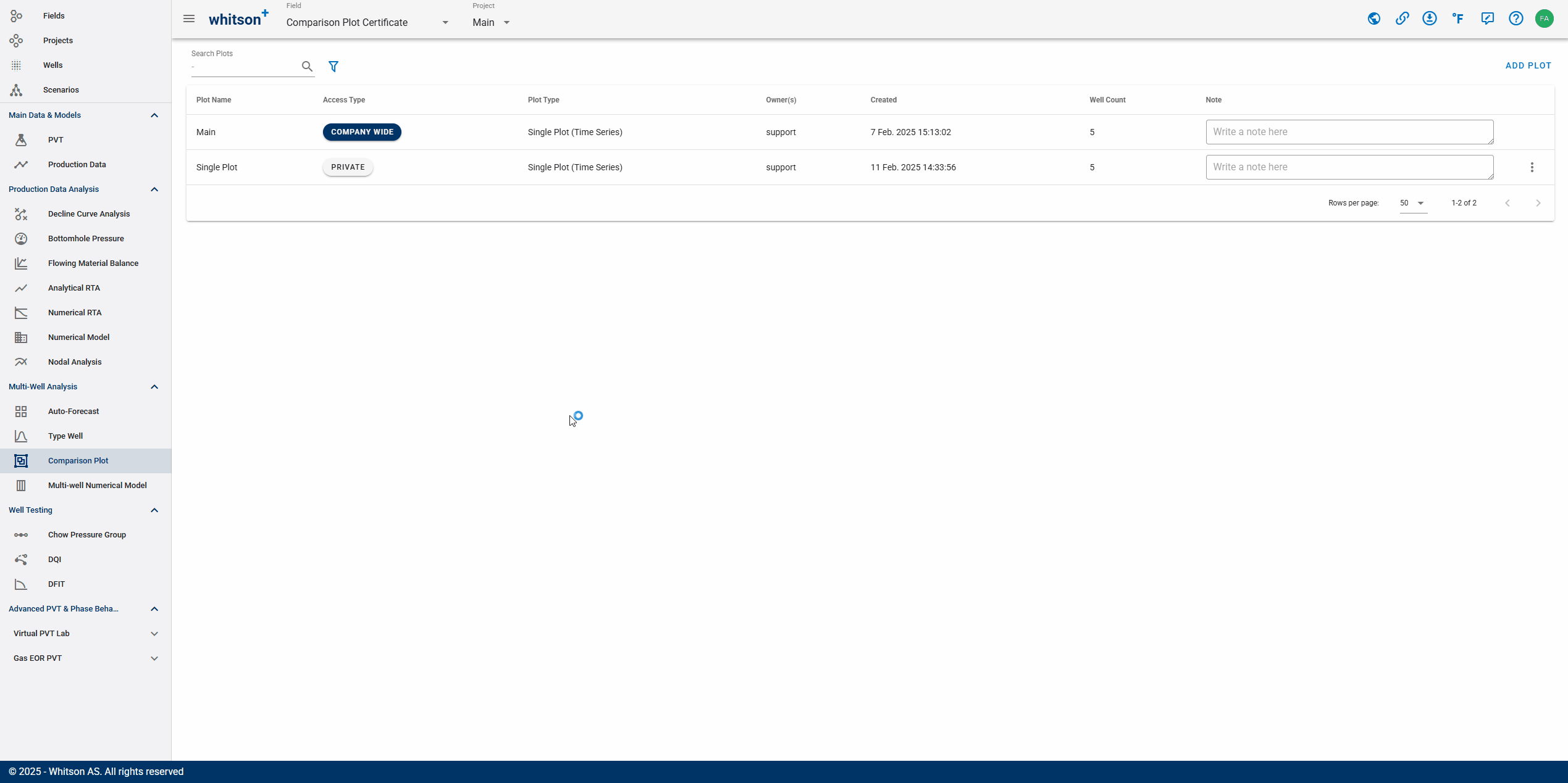
2. Single Plot
In this section, you will learn basic plotting skills, including creating a plot and exploring key features and buttons; customizing the plot for better visualization; performing normalization on both the y-axis and x-axis, adding a secondary y-axis variable, and aggregating the plot using sum or average methods.
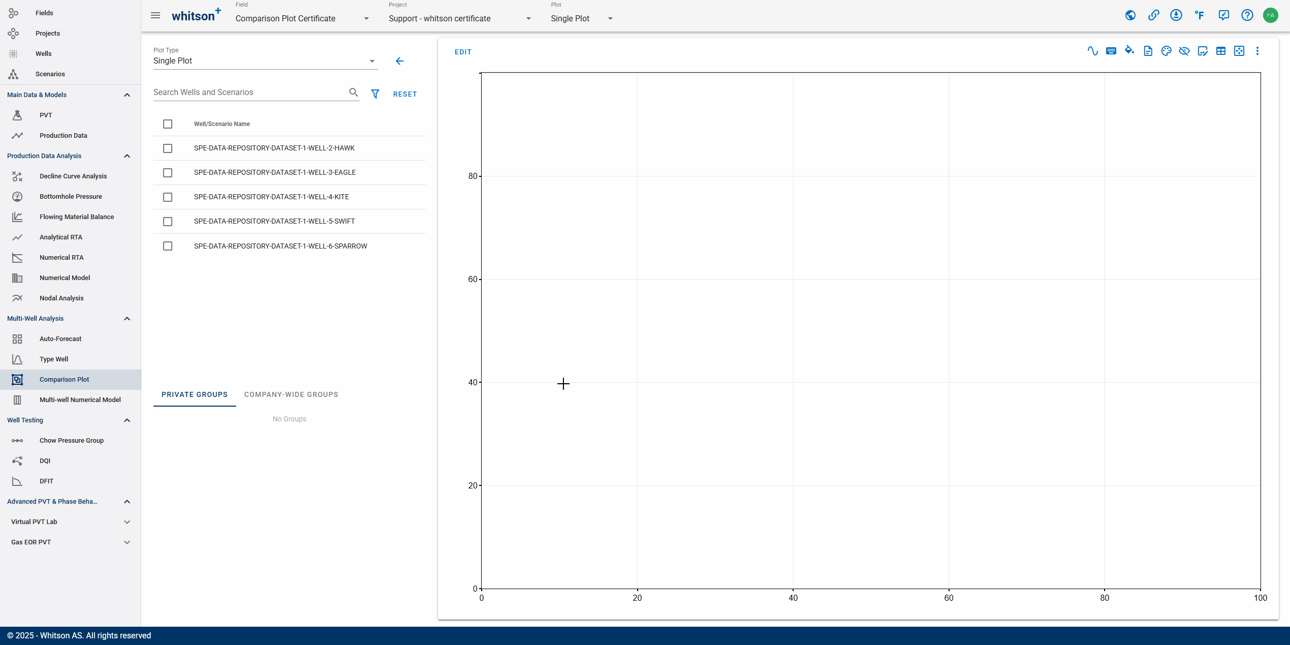
2.1. Create a Plot
Here, we will create a blank single-plot for the project. You can generate as many plot as you want, edit them, and even copy them to other projects or fields.
- Go to the Comparison Plot in the navigation panel.
- Click ADD PLOT in the upper right.
- Enter a Name, called it "Single Plot", and select all wells by checking the box at the top of the well list.
- Click ADD PLOT to the lower right.
- All steps are shown in the .gif above.
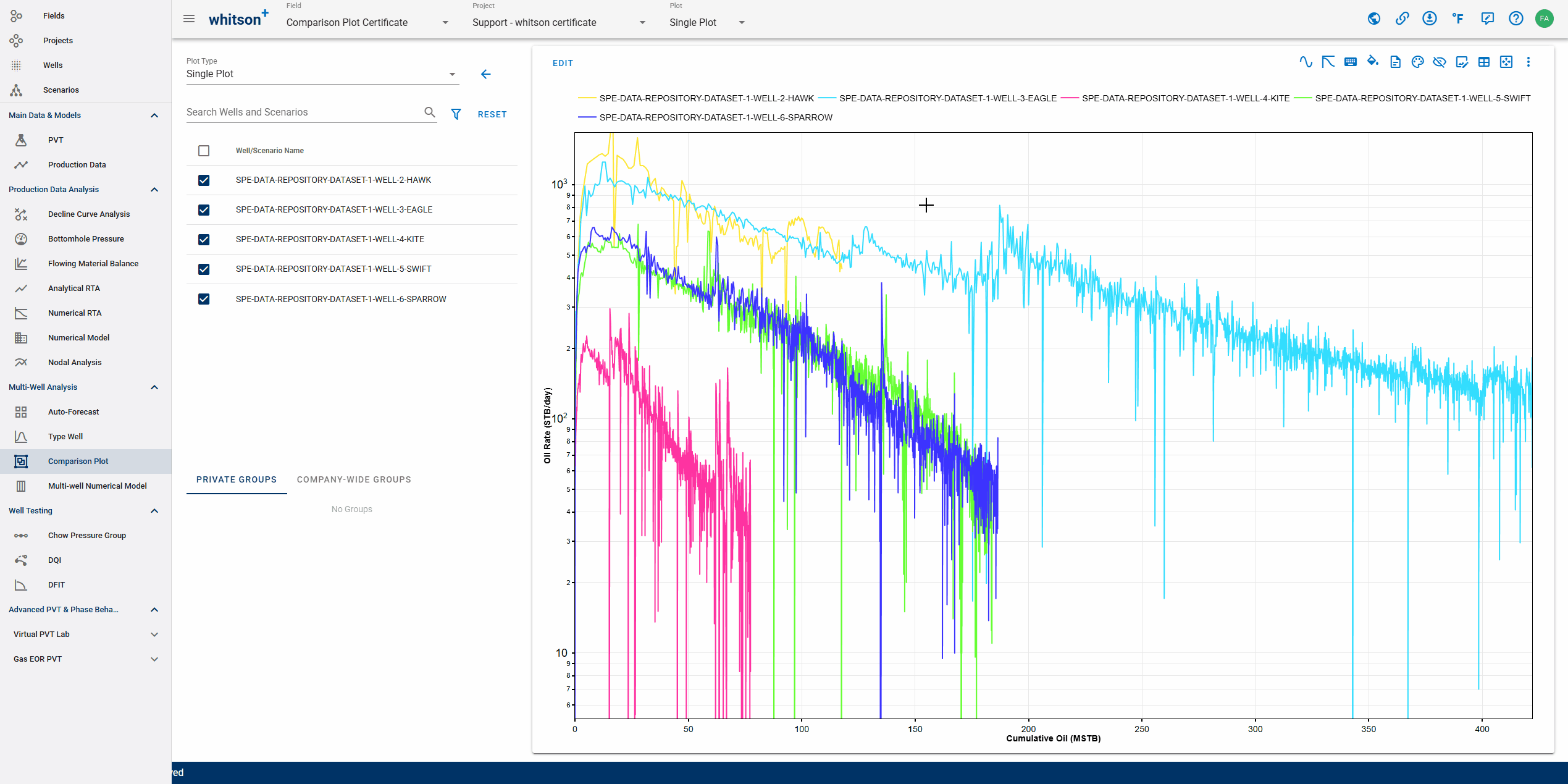
2.2. Make Rate-Time Plot (Semi-log)
For the first plot, you will make a rate-time plot in semi-log scale by adding active oil rate on the y-axis and time on the x-axis. A ton of variables you can choose from the list (i.e. BHP, LFP, Nodal, etc.) as the variable on the axes.
- In the upper left of the plot, click EDIT.
- In the Y-AXIS DATA tab, search by typing "Oil Rate" on the field with magnifying icon. You can also scroll down the list to find the variable manually.
- Change the Scale (above the y-axis variable field) to Logarithmic.
- Navigate to the X-AXIS DATA tab, the variable used here is Time (default).
- Click SAVE in the lower right.
- Select all wells on the list (besides the plot) by checking the box at the top of the list (selecting all wells/scenarios). Otherwise, you can select specific wells to be displayed on the plot.
- All steps are shown in the .gif above
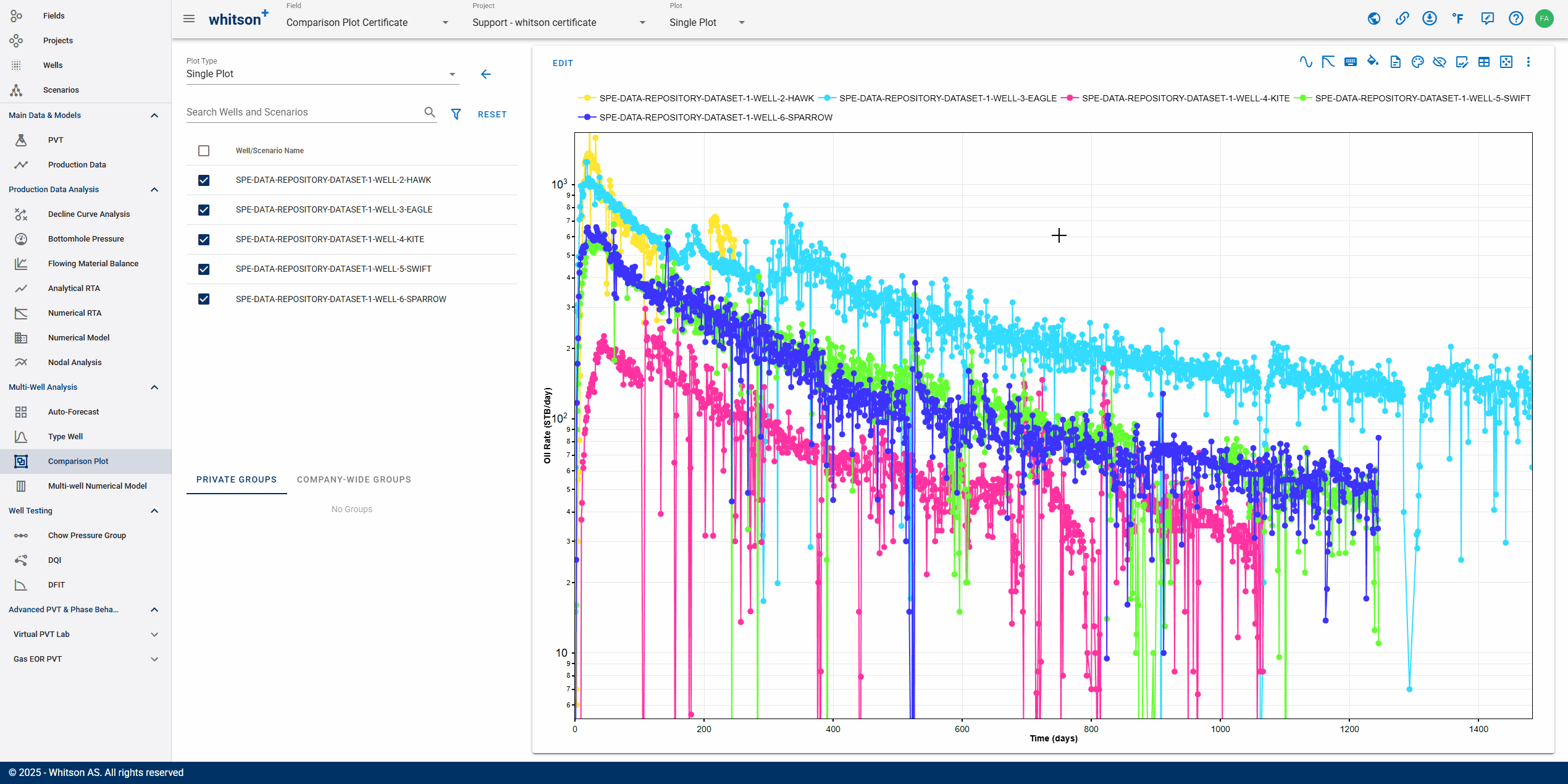
2.3. Customize Layout: Spreading Color
By default, the plot colors will be similar as they follow the same palette. To enhance contrast between wells or scenarios, you can spread the colors. This improves visual clarity and makes comparison analysis easier.
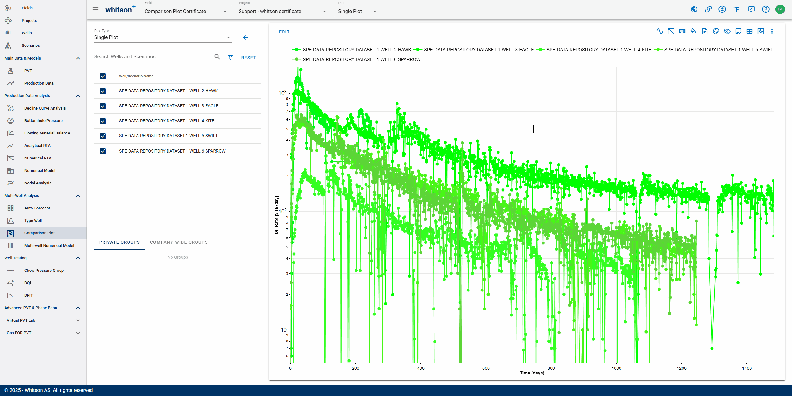
- Click Change Colors (palette icon) on the top righ of the plot.
- Select Spread Colors to make your plot colors contrast between each other.
- All steps are shown in the .gif above
2.3.1. Emphasize Curves Using Colors
You can also color the plot by attribute, like Well Data, Reservoir Properties, or Completion Metrics.
From here, you can bulk edit colors for all wells and scenarios, and you can also assign a custom color to a specific well or scenario if you want it to stand out on the plot.

- Navigate to the LAYOUT & DESIGN tab using one of the following methods:
- Put your cursor into any data points in the plot, then "ctrl" + "left click".
- In the upper left of the plot, click EDIT.
- Click Open Layout & Design (diamond icon with droplet) in the top righ of the plot.
- Bulk edit the Line Color for all wells/scenarios for the current variable (Oil Rate):
- Click LINE COLOR and select a new color.
- Change the color for one well, then copy-paste or drag to apply it to other wells.
- Click SAVE in the lower right.
- All steps are shown in the .gif above
Note: To revert the colors to their original spread, click Spread Colors in the Change Colors icon.
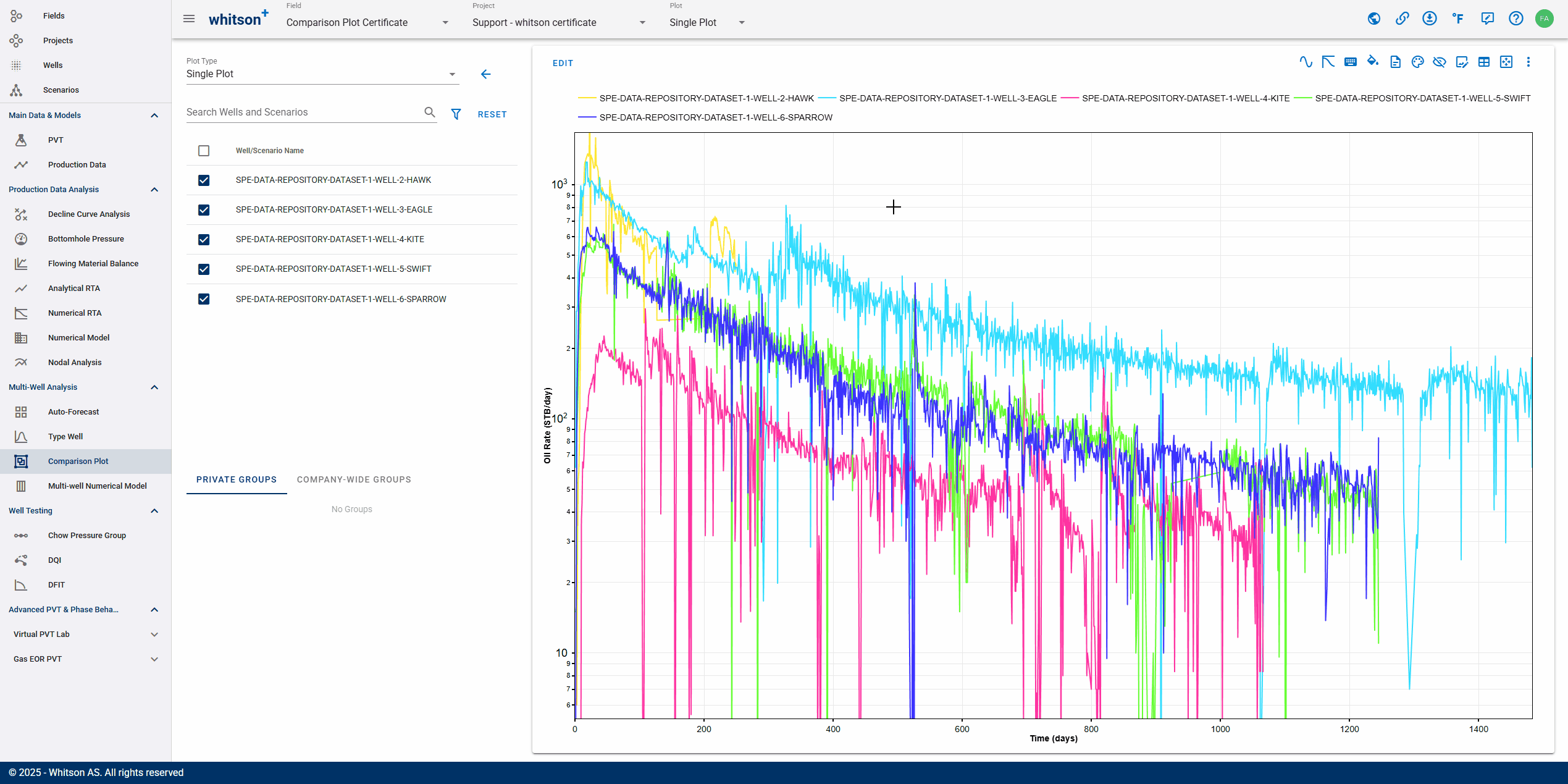
2.4. Smoothing Plot
Our rate-time data appears jagged, so we can apply Smoothing to reduce noises and outliers which will improve clarity and make the analysis more effective. The number in the smoothing function represents how many forward-looking data points are included when calculating the moving average. A higher number results in a smoother curve by averaging over a larger window, which helps reduce short-term fluctuations and highlight overall trends in the data.

- Click Smoothing (wavy-line icon) in the top righ of the plot.
- You can adjust smoothing frequency number for individual wells by dragging the slider or typing a value. Here, you will try to smooth all wells with same frequency and it can be done by clicking SMOOTH ALL on the top left of the page.
- Set the smoothing frequency for all wells to 10.
- Click RESET in the top left of the panel to revert to the original plot (without smoothing).
- All steps are shown in the .gif above
Note: We will use the original plot for the next exercises in this section.
2.5. Remove Markers
- Navigate to the LAYOUT & DESIGN tab using one of the following methods:
- Put your cursor into any data points in the plot, then "ctrl" + "left click".
- In the upper left of the plot, click EDIT.
- Click Open Layout & Design (diamond icon with droplet) in the top righ of the plot.
- You can adjust your plot settings here, i.e. click MARKER TYPE and make it into No Marker. This will bulk editing the marker for all wells/scenarios for Oil Rate plot.
- Click SAVE in the lower right.
- All steps are shown in the .gif above
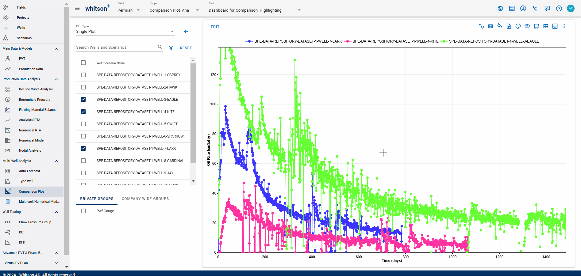
2.6. Highlighting a Plot
The highlighting feature can be used in a plot to emphasize a specific time series while fading the others into the background.
To highlight (or unhighlight) a time series, simply left-click it on the plot or select it from the well list. You can also click Remove All Highlights in the toolbar to restore the plot to its default view.
2.7. Customize Plot (Additional Information)
Here, you can customize the plot layout, including legend size, legend location, grid lines, axes title size, and other visual elements to enhance readability and presentation.

- Click Customize Plot (square icon with pen) in the top righ of the plot.
- Change the Axes Title Size, Tick Text Size, Legend Size, Grid-lines
- Click RESET PLOT STYLE to reset the plot layout.
- All steps are shown in the .gif above
2.8. Share Plot (Additional Information)
Here, you can share your plot with others, even if your project is set to Private.

- Click Copy URL (chain icon) in the top righ of the page.
- Alternatively, copy the webpage link from the browser's address bar.
- All steps are shown in the .gif above
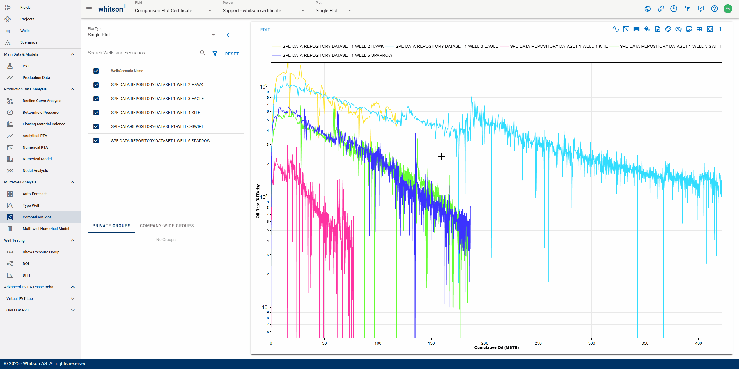
2.9. Edit X-Axis Data
You'll change the x-axis variable from Time to Cumulative Oil, so now you have a rate-cum plot. In the next section, using this plot, we will perform normalization, such as normalizing by lateral length, to standardize production comparison.
- In the upper left of the plot, click EDIT.
- In the X-AXIS DATA tab, search by typing "Cumulative Oil" on the field with magnifying icon. You can also scroll down the list to find the variable manually.
- Click SAVE in the lower right.
- All steps are shown in the .gif above
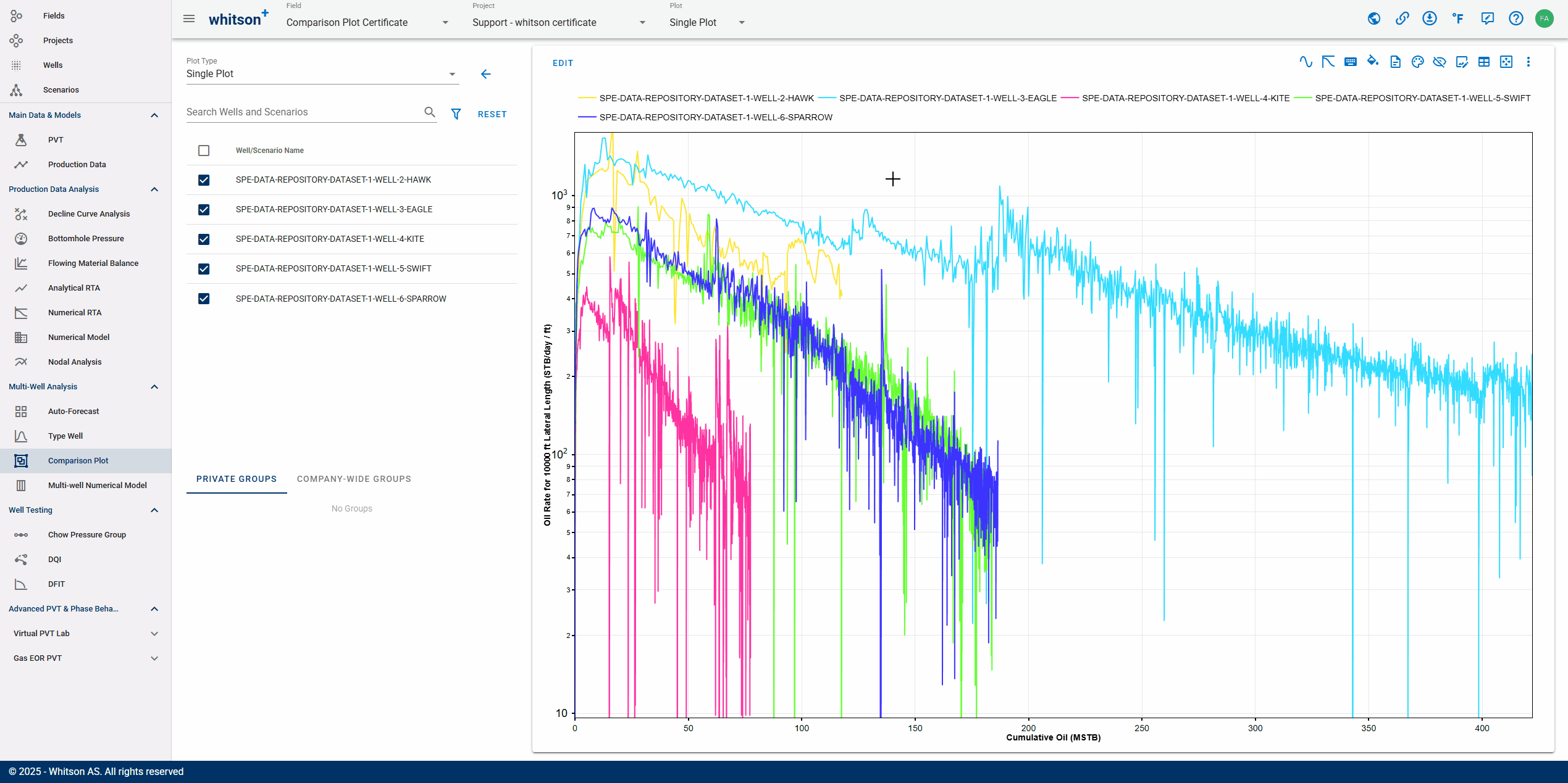
2.10. Normalize Y-Axis
Normalizing the production variable (Oil Rate) by Lateral Length on the y-axis is a common method to standardize production comparisons, allowing for more meaningful analysis across different wells.
- In the upper left of the plot, click EDIT.
- Go to the LAYOUT & DESIGN tab and click NORMALIZATION for the current y-axis variable (Oil Rate).
- Select Normalize by as Lateral Length and input 10000 in the Add multiplier field.
- Click SAVE in the lower right.
- All steps are shown in the .gif above
2.11. Normalize X-Axis
Similar procedure as in the previous section, but this time, we will normalize the cumulative oil by lateral length.
- In the upper left of the plot, click EDIT.
- Navigate to the X-AXIS DATA tab.
- Select Normalize by as Lateral Length and input 10000 in the Add multiplier field.
- Click SAVE in the lower right.
- All steps are shown in the .gif above
Note: For the next section, turn off normalization by selecting None in the Normalize by field for both the y-axis and x-axis. So, now you have the rate-cum plot again (without normalization).
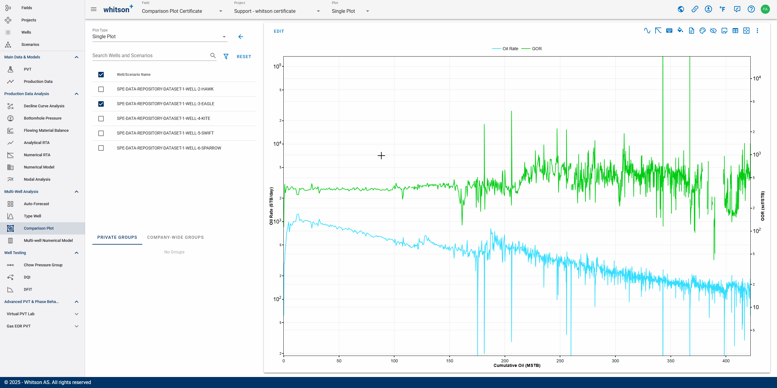
2.12. Add Multiple Axes
Here, we will plot GOR variable on a secondary y-axis. You can add as many axis you want to the plot, i.e. choke size, well count, etc.
- In the upper left of the plot, click EDIT.
- Go to the Y-AXIS DATA tab.
- Click Add new y-axis (plus icon) at the bottom middle of the pane.
- Set the Scale to Logarithmic.
- Position the secondary y-axis on the right of the plot by selecting Location to Right.
- Click SAVE in the lower right.
- All steps are shown in the .gif above
2.13. Aggregating Plot (Sum and Average)
You can aggregate your selected wells/scenarios in the plot using two different methods: sum or average.
- Sum: adds all y-axis values for each variable at every time step.
- Average: calculates the arithmetic mean of all y-axis value for each variable at each time step.
- Select all wells on the list (besides the plot) by checking the box at the top of the list (selecting all wells/scenarios). Otherwise, you can select specific wells to be displayed on the plot and for aggregation purposes.
- In the upper left of the plot, click EDIT.
- Navigate to the LAYOUT & DESIGN tab.
- Click AGGREGATE under the LAYOUT & DESIGN tab and select All. All means it will aggregate all the wells/scenarios you select or shown in the plot.
- Navigate to each variable in this tab. For Oil Rate, set AGGREGATE METHOD to Sum (default).
- For GOR, set AGGREGATE METHOD to Average.
- Click SAVE in the lower right.
- All steps are shown in the .gif above
Instead of aggregating all wells/scenarios shown in the plot, you can also aggregate wells/scenarios based on their attributes (e.g., reservoir, well trajectory) or custom groups (can be set up in the Wells section of the left navigation panel)
Note: To turn off the aggregation, go to LAYOUT & DESIGN tab and click TURN OFF AGGREGATION.
3. Advanced Plot
In this section, you will learn advanced plotting skills, including appending/removing forecasts to analyze future trends, creating 2x2 plots for multi-variable comparisons, and synchronizing plot colors for better visualization and consistency.
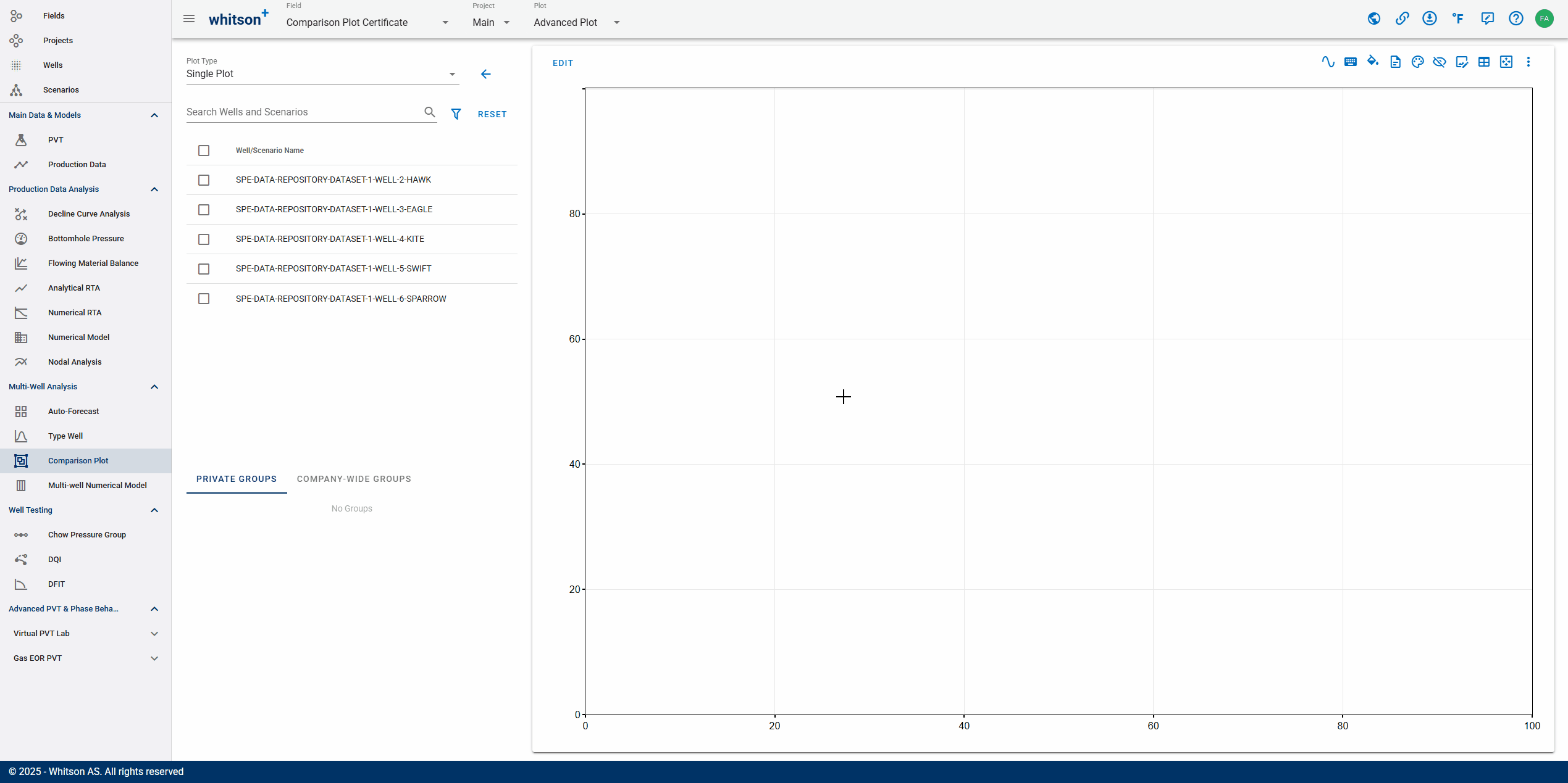
3.1. Create a Plot
Now, we will create a blank advanced-plot for the project. You can generate as many plot as you want, edit them, and even copy them to other projects or fields.
- On the Comparison Plot page, click ADD PLOT in the upper right.
- Enter a Name for the plot, call it "Advanced Plot", and select all wells by checking the box at the top of the well list.
- Click ADD PLOT in the lower right.
- All steps are shown in the .gif above
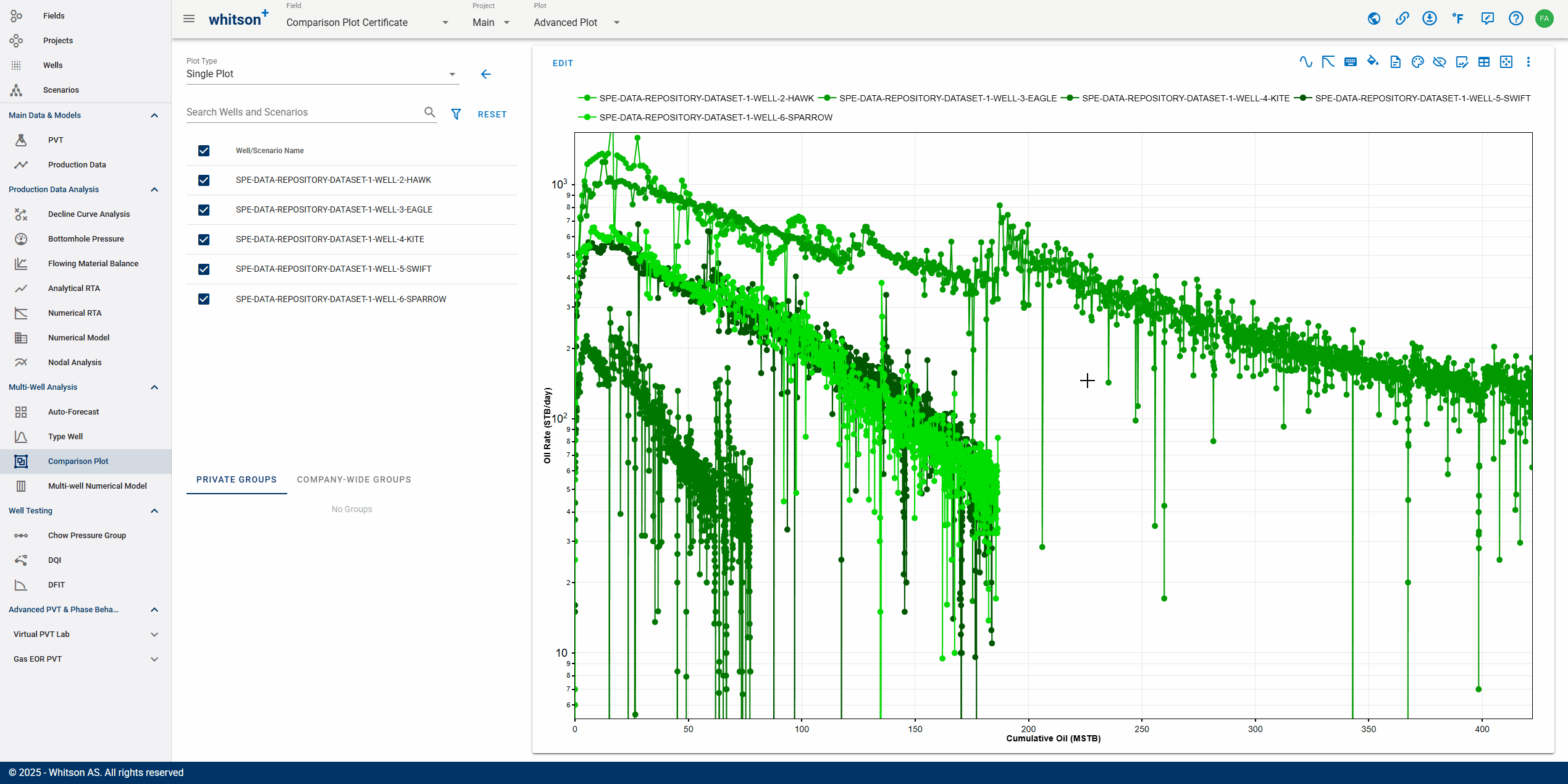
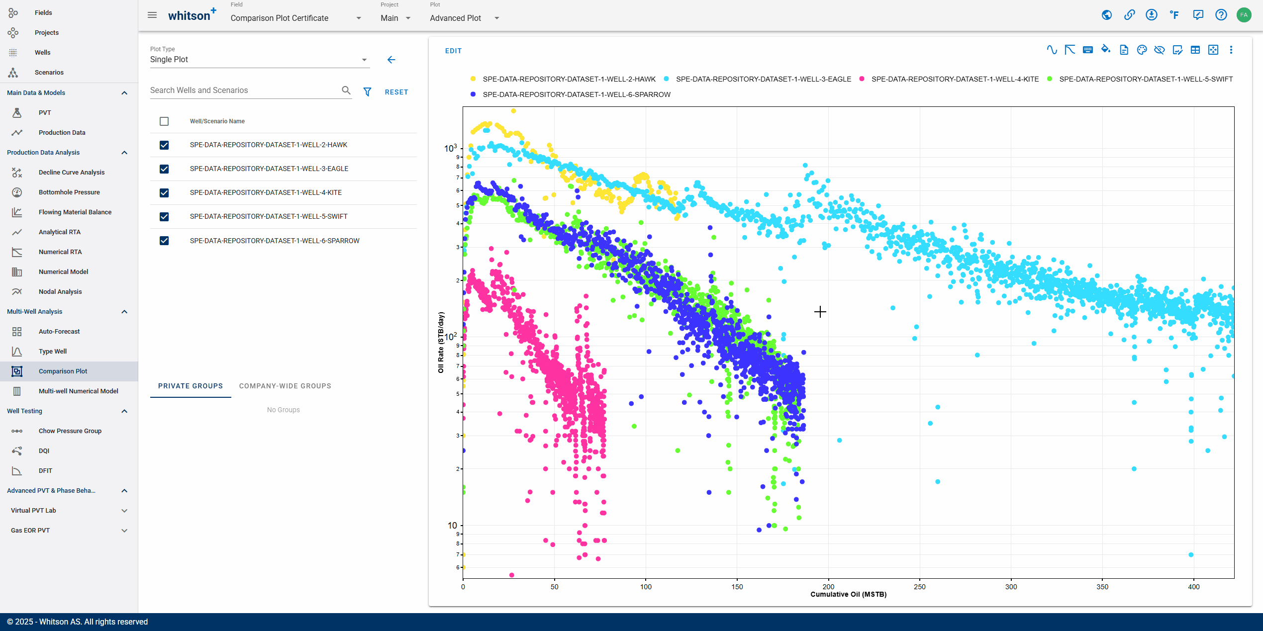
3.2. Make Rate-Cum Plot (Semi-log)
We will use a rate-cum plot for the next sections. The steps to create it are the same as in the Section 2.2.
- In the upper left of the plot, click EDIT.
- In the Y-AXIS DATA tab, search by typing "Oil Rate" on the field with magnifying icon. You can also scroll down the list to find the variable manually.
- Change the Scale (above the y-axis variable field) to Logarithmic.
- Navigate to the X-AXIS DATA tab, input the variable as Cumulative Oil.
- Click SAVE in the lower right.
- Select all wells on the list (besides the plot) by checking the box at the top of the list (selecting all wells/scenarios). Otherwise, you can select specific wells to be displayed on the plot.
- All steps are shown in the .gif above
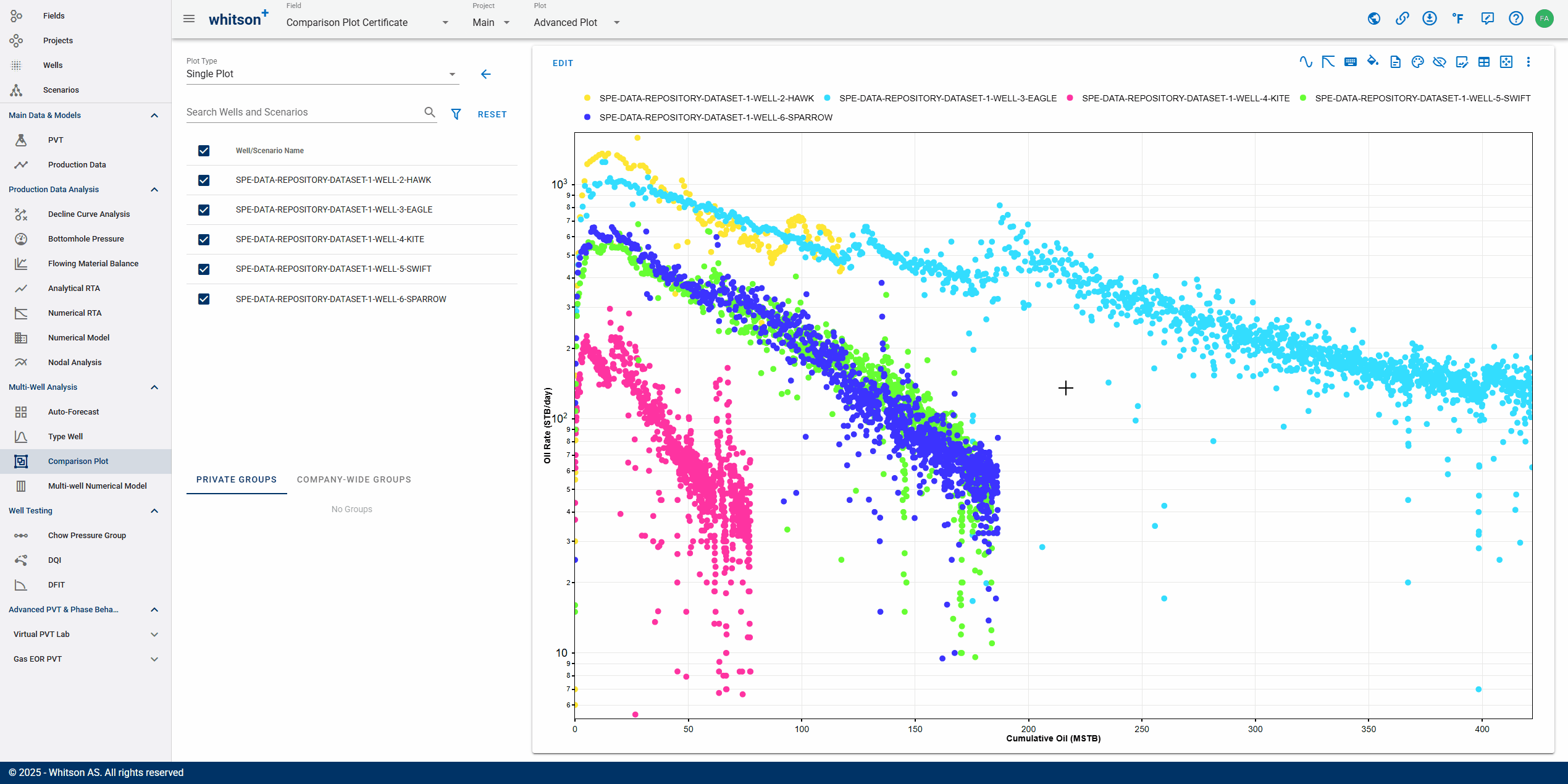
3.3. Edit Plot Settings
Here, we will spread the colors for better distinction and change the plot style from the line-marker (default) to marker-only for a clearer data represenation.
- Click Change Colors (palette icon) on the top righ of the plot.
- Select Spread Colors to make your plot colors contrast between each other.
- Navigate to the LAYOUT & DESIGN tab using one of the following methods:
- Put your cursor into any data points in the plot, then "ctrl" + "left click".
- In the upper left of the plot, click EDIT.
- Click Open Layout & Design (diamond icon with droplet) in the top righ of the plot.
- click LINE TYPE and make it into No Lines. This will bulk edit the line for all wells/scenarios for the Oil Rate plot.
- Check the Link box for all wells. This linking feature ensures that all coloring elements (line, marker fill, marker border) are synchronized - when you change one, the others will automatically update to the selected color.
- Click SAVE in the lower right.
- All steps are shown in the .gif above
There also another option to coloring the plot which is by attribute such as by well data, reservoir properties, and completion metrics.
3.4. Append / Remove Forecasts
You can append a DCA forecast for each well in the comparison plot, even if you have not manually performed a DCA fit in the Decline Curve Analysis module. By default, the software performs DCA auto-fit in the background after you upload production data.
- If you navigate to the Decline Curve Analysis module, you will find the auto-generated DCA fit saved under Current Case.
Note: You can adjust your DCA fit and then append it to the comparison plot. Here, we will use the auto-fit result as is.
- Click DCA Forecasts (x-y graph with decline-wavy line icon) in the top righ of the plot.
- A Custom DCA Forecasts pop-up window will appear.
- In the DCA Forecast to Apply field, select Current Case and click APPLY FORECAST TO ALL to bulk apply your saved DCA case to all wells/scenarios.
- If you have multiple saved DCA cases and want to apply them differently to each well, you can manually assign them in the Forecast Name column.
- Click SAVE in the lower right.
- All steps are shown in the .gif above
Note: To remove the forecasts, open the Custom DCA Forecasts window and set DCA Forecast to Apply to None for all wells/scenarios. We will use the comparison plot without the forecasts in the next section.
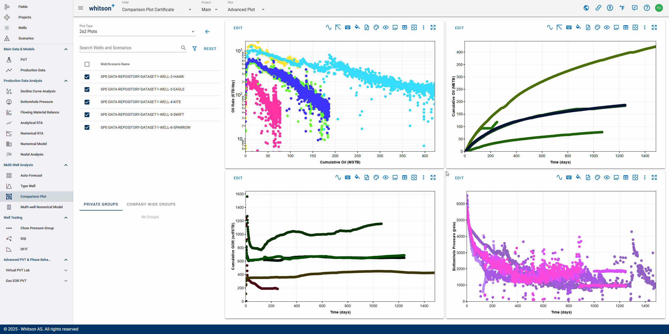
3.5. 2x2 Plot
- Select 2x2 Plots under the Plot Type field in the top left of the page.
- (Optional, but recommended) Hide the legend on Quadrant-1 (top-left plot) by clicking Hide Legend (eye with diagonal-line icon) in the top right of the plot.
- Add variables to other quadrants using the same steps as in the previous section:
- Quadrant-2 (top-right plot): Cumulative Oil vs. Time (linear scale)
- Quadrant-3 (bottom-left plot): Cumulative GOR vs. Time (linear scale)
- Quadrant-4 (bottom-right plot): BHP vs. Time (linear scale)
- All steps are shown in the .gif above
3.6. Synchronize Color
Here, we will synchronize colors across all plots in each quadrant to maintain consistent coloring for the same well/scenario.
- Click Change Colors (palette icon) in the top righ of the plot that will serve as the coloring basis for other plots.
- (Optional, but recommended) Click Spread Colors to enhance contrast between different wells/scenarios.
- Open the Change Colors icon again, and select Synchronize Colors to apply consistent colors across all plots.
- All steps are shown in the .gif above
4. Exercises: RNP-Square Root of Time Plot and Cross Plot
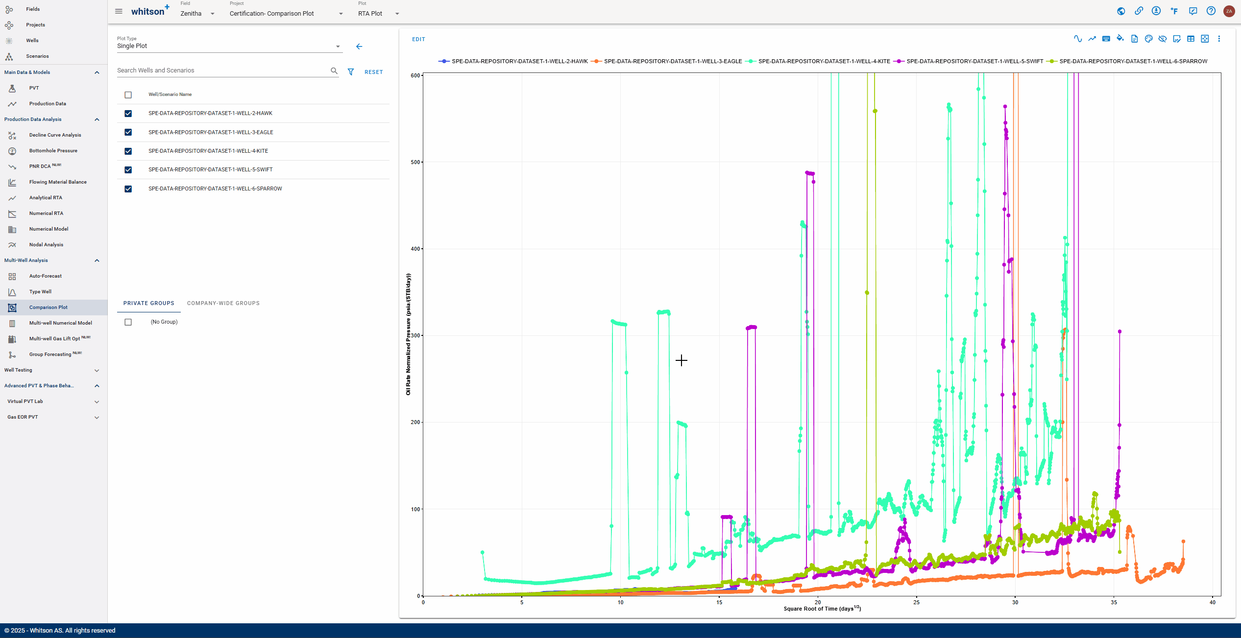
4.1. RNP-Square Root of Time Plot
In this section, you will exercise creating an RTA plot (RNP vs. square-root time plot) similar to the figure shown below.
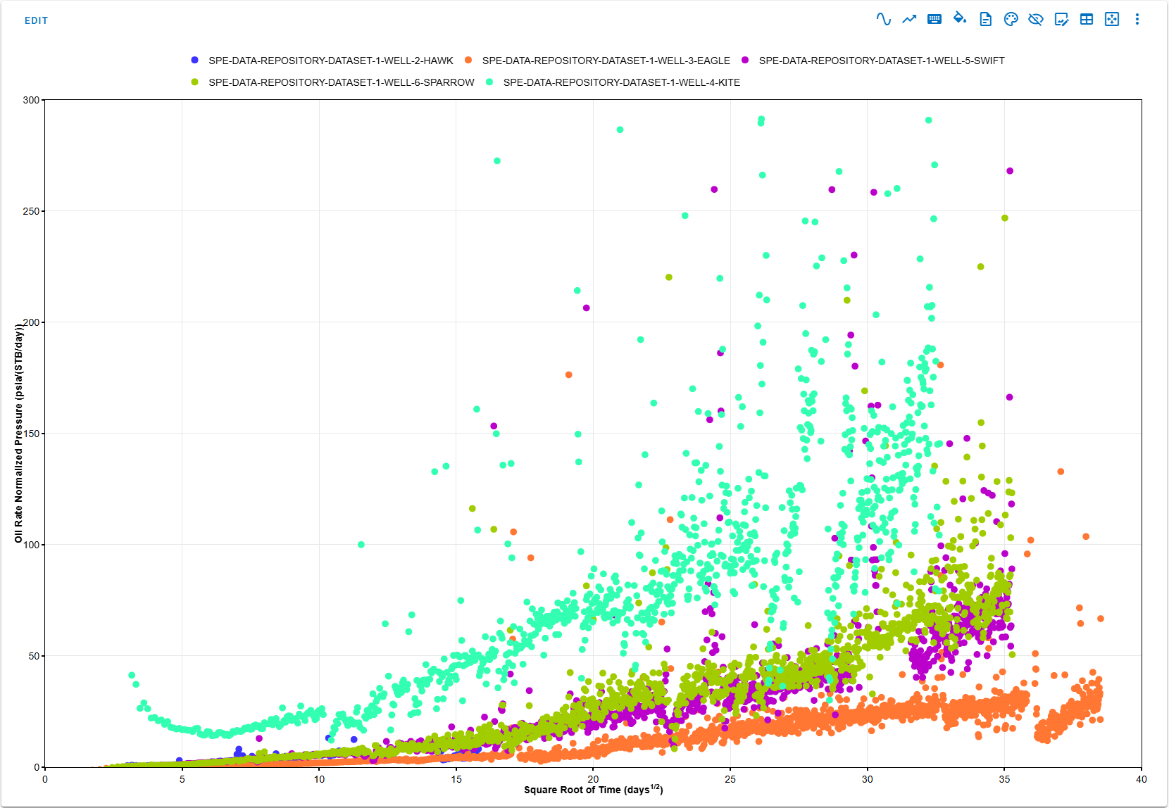
Guide for this exercise:
- Create a new plot and name it "RTA Plot".
- Add "Oil Rate Normalized Pressure" in y-axis data (linear scale).
- Add "Square Root of Time" in x-axis data (linear scale).
- Select all wells to be displayed on the plot.
Bonus question: Which well is the most productive based on this plot?
4.2. Cross Plot
Here, you will learn how to use Cross Plot mode, an alternative to time-series plots that allows you to visualize the relationship between any two variables. For example, you can combine a time series RNP vs. Square Root of Time plot and cross DCA EURs vs. CUM180 plot. This is especially useful for identifying correlations, performance trends, and outliers across wells, helping you evaluate well design, reservoir quality, or production efficiency more effectively.
- Select 2x2 Plots under the Plot Type field in the top left of the page.
- Navigate to the empty plot directly under the first plot and click Edit in the upper left.
- At the top of the Edit window, toggle on the Cross Plot switch.
- Add "Oil CUM180" in y-axis data (linear scale).
- Add "Lateral Length" in x-axis data (linear scale).
- Now, you may customize the plot to adjust marker size, hide the legend, or spread and synchronize colors as previously done.
- All steps are shown in the .gif above
5. Done?
When you are done with your Comparison Plot certification, please:
- Send an e-mail to certification@whitson.com
- Make the subject: "whitson+ Comparison Plot certificate: [YOUR NAME HERE]".
- Include the link to your project.
- If you have any notes, comments, or observations related to the well, feel free to share them with us. Also, feedback on the user-friendliness of the software is always appreciated.
After that, we'll provide some feedback on your work and issue your whitson+ certificate if all looks good.
6. Want to learn more?
Schedule a Comparison Plot session with one of our engineers. Contact support@whitson.com.